
Bruises — The Data We Don’t See
Clinical records alone hardly capture the impact the illness of a child has on a family. This is how we used music and art to understand and communicate the information that was missing.
Giorgia Lupi and Kaki King — Bruises: The Data We Don’t See
In early August 2017, my friend and collaborator Kaki King — acclaimed musician and composer — woke up her almost three-year-old daughter, Cooper, at their house in Brooklyn and saw that she had blood in her mouth. Kaki simply asked her to stick out her tongue, and on it was a lesion the size of a dime.

“Heart racing, panicking on the inside, I calmly packed her up and went straight to her pediatrician, who send us directly to the ER. After a blood test she was diagnosed with a condition called Idiopathic Thrombocytopenic Purpura, or ITP, an auto-immune disease where her body attacks her platelets, a crucial part of blood clotting. She was getting spontaneous bruises and burst blood vessels called petechiae all over her body. The following weeks were a terrifying spree of platelet transfusions, courses of steroids, blood tests, and abject terror as we watched her platelet levels rise and fall.” — Kaki.

Spontaneous bruises from ITP that developed during Cooper’s hospital stay
When I learned about what she and her family were going through, I wanted to find a way to provide support, or at least help them give clarity and help them make sense of what was happening in their lives.
I am a data visualization designer and artist.
With my research and practice I use data as a tool to better understand human nature, and data visualization as my expressive medium to narrate what I discover.

My recent site-specific artwork for the Museum of Modern Art, depicting how fashion influences our lives through hand-crafted data.
Through my work, I thought, I could try to help her process and communicate her emotions: the feelings any of us experience when coping with our own illness, or that of a beloved one.
At that point, Kaki and I had been collaborating for a while. We had started working together one year earlier, when design guru John Maeda enrolled us for an unusual project: creating the brand identity for a limited edition of Hennessy V.S.O.P. Privilége, celebrating the two hundred years of the prestigious cognac, where we mixed our diverse sets of skills to create visual imaginary made of music and data visualization.
Kaki and I fell in love with each other’s work immediately, and decided to keep on exploring together.

A Dialogue Between Four Hands — Data and Musical Artwork — Our second collaboration.
Early in 2017 we guided an audience of 2,000 people at the Opera Theater in Cape Town how to “see” music through a laborious dissection and representation of what Kaki does with her hands on her guitar as she plays, where both the song and the visuals were informed by personal data collections from our lives
This time, in this particular time of Kaki’s life, we felt the need to go deeper. We combined our art practices to take back some control over these frightening events: illuminating the most humane dimensions of what we so coldly call data, and making a cathartic sort of beauty out of this disturbing time.
ITP is a very visual disease: it presents with visual symptoms of abnormally large bruising and petechiae, and as Kaki explains:
“The doctor’s directive to us was to watch her skin for any significant changes. Since I had been working with Giorgia I had learned to do personal data collection, so I began to write down what I was seeing on Cooper’s skin, what activities we did that day, what treatments she had and what her reading were, as well as how I was feeling. My fear, stress, my hope. My thoughts and feelings.”

We started daily observations — juxtaposing clinical inputs from Cooper’s lab tests with much softer data from Kaki’s life — to channel stress and anxiety into a semblance of control through meditative action that could help Kaki and her wife make sense of what was happening.

My working sheet as interpreting Kaki’s data collection
These unique four months of their lives, ultimately became a musical score and a data visualization, but probably not exactly the type of representation someone would normally expect from clinical data.

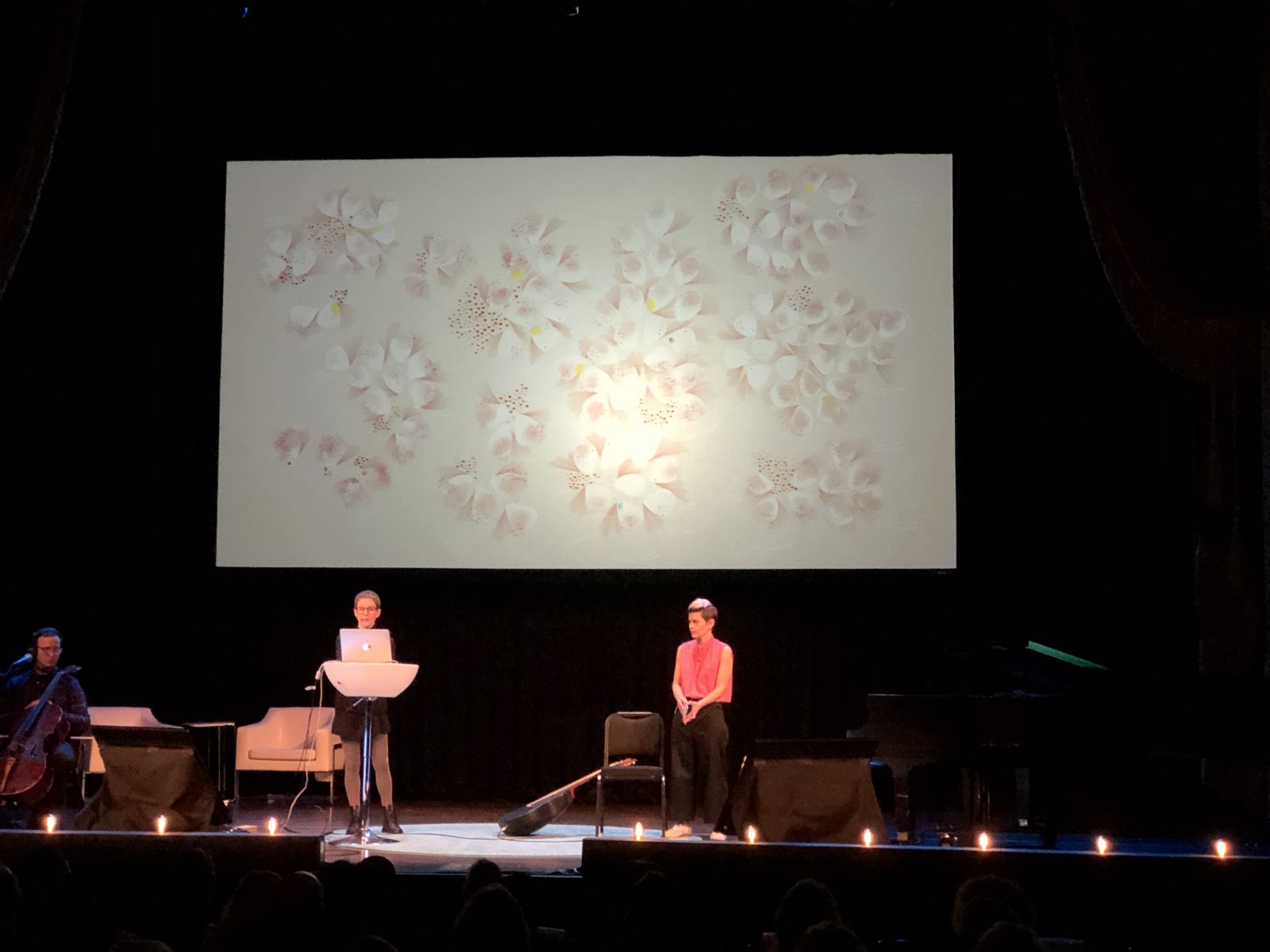
Giorgia Lupi and Kaki King — Bruises: The Data We Don’t See / The Data Artwork. Scroll down to experience the artwork alongside the music.
As I was reading Kaki’s records, I was overwhelmed with feelings. I asked myself:
Can a data visualization evoke empathy and activate us at an emotional level, and not only at a cognitive one? Can looking at a data visualization make you feel part of a story of someone’s life?
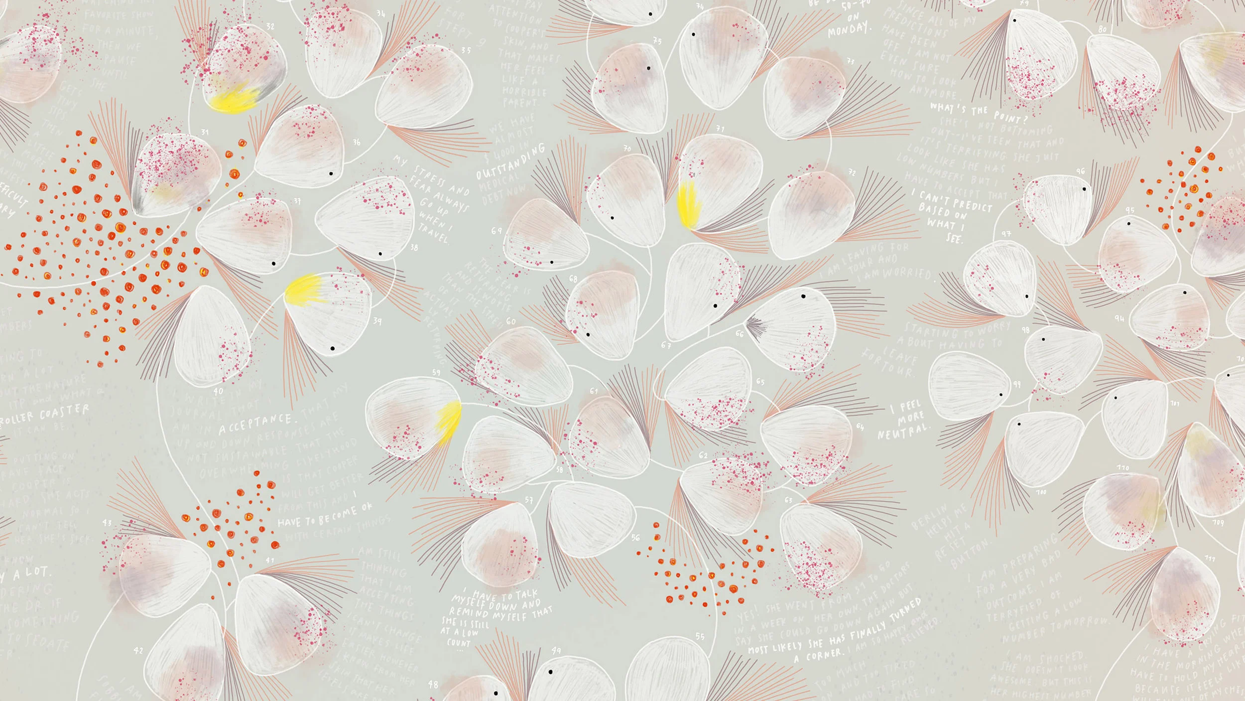
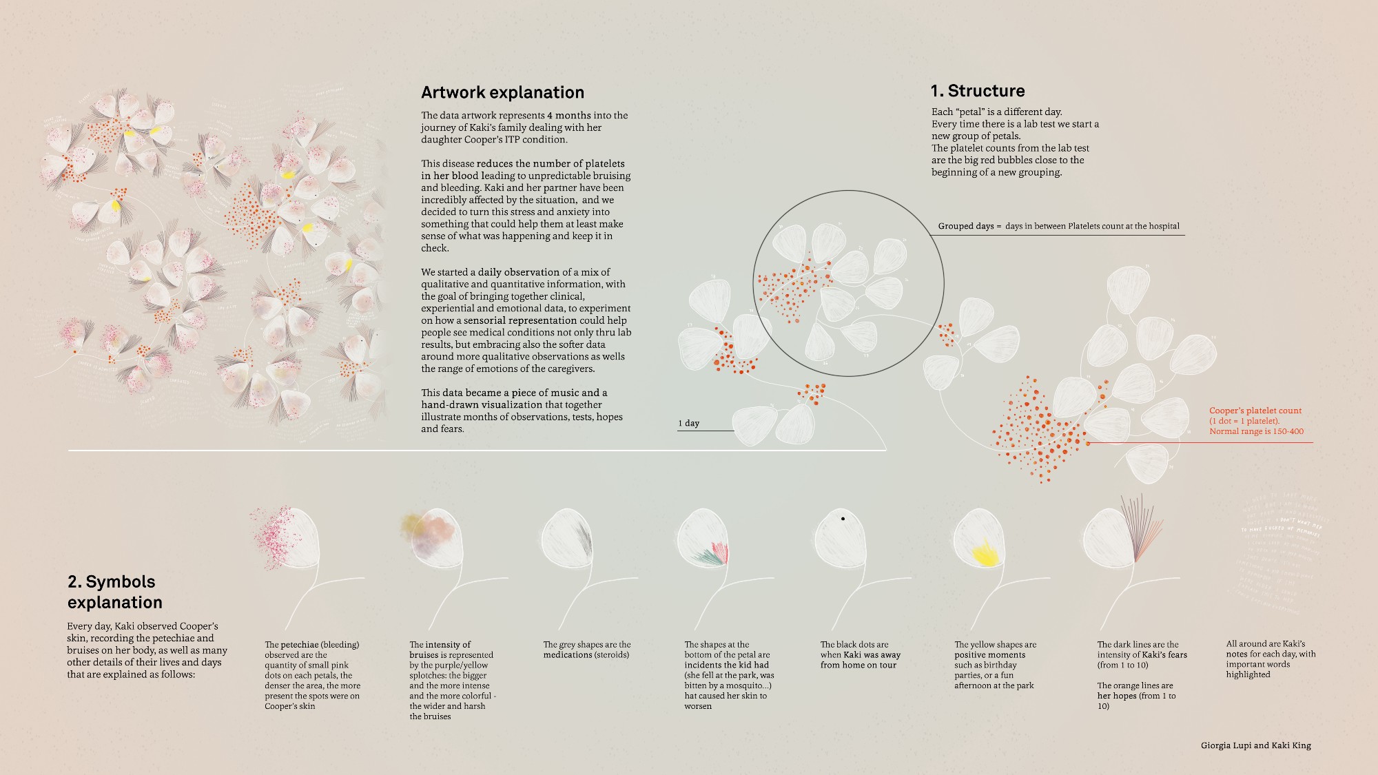
To begin this exploration, I structured a fluid timeline, where each one of the white elements indicates a new day. Days are grouped in sections: the moments between Cooper’s admissions to the hospital to have her blood checked, the days that felt more monumental in Kaki’s and her family’s experience.

Legend— main structure
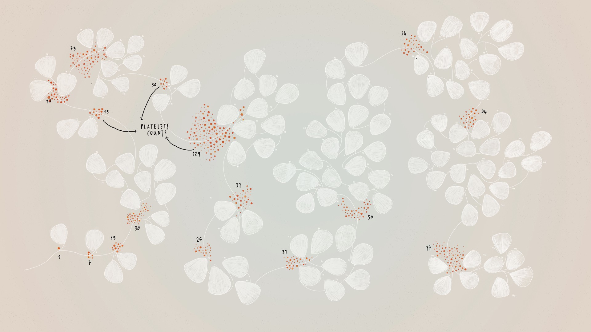
Thus, in the visualization, a new group of days starts when a lab test was performed.
The platelet counts from the results are represented by the red dots at the beginning of the group. (The normal range of platelets in the blood is 150–400. At the beginning of this time period, you can read counts of 1, 7, 30; numbers that have powerful meanings and that are connected to deep sentiments.)
Layers— Platelet counts
Then I incorporated Cooper’s skin as observed daily by Kaki, experimenting with how to visually depict the intensity of the disease through the use of different brushes and drawing materials.
The intensity of bruises on Cooper’s body is represented by the purple and green splotches (the bigger, more intense and more colorful, the wider and deeper the bruises).

The amount of petechiae (small purple spots caused by bleeding into the skin) are represented by tiny pink dots on each day (the denser the area, the more present the spots on Cooper’s skin). When Cooper was taking steroids, grey brush strokes are on top of the day. If Cooper had some incidents that caused her skin to worsen, colored pencil strokes are added.


Kaki tours a lot, and she was always feeling very stressed to be far from home during this time. In the visual, a black dot is added to the day when Kaki was away.

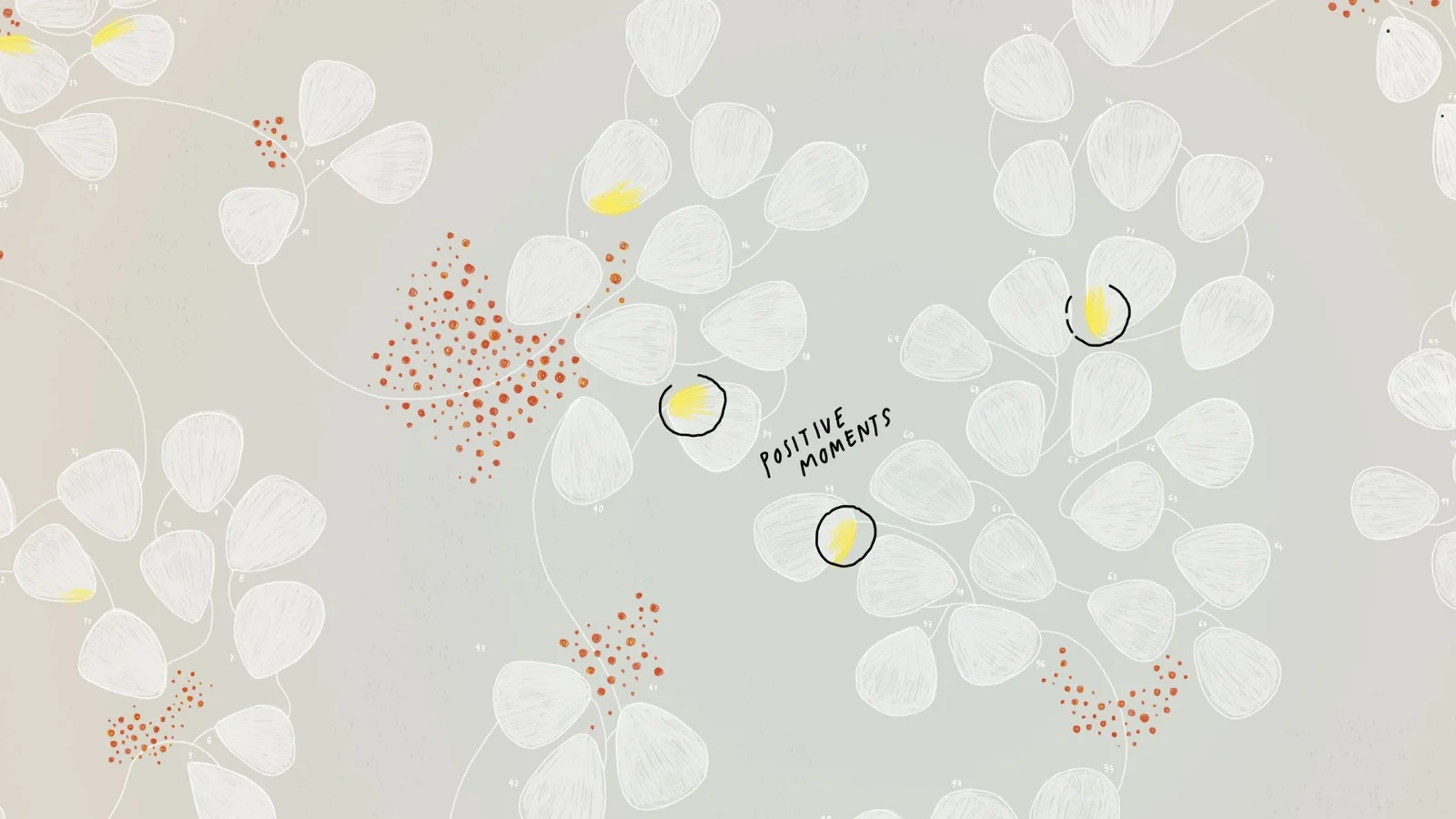
In these dark months, there were also positive times that I represented through bright yellow spots that cheer up the visual.
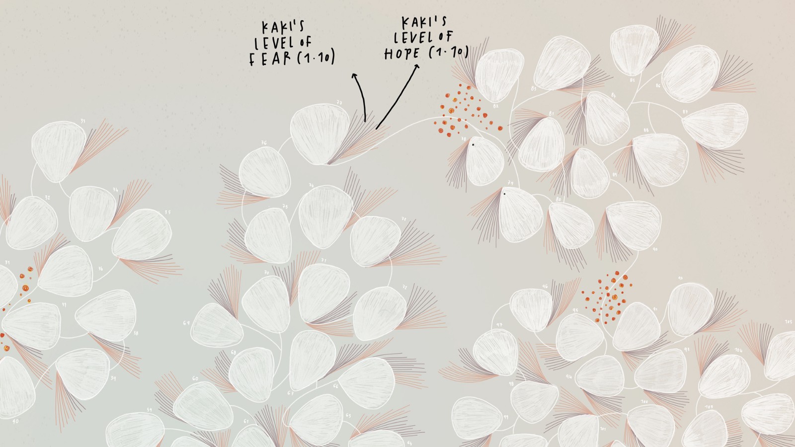
Lastly, Kaki also kept track of her level of hope and fear for the day on a scale on 1 to 10, that I visualized through these floating lines framing the day.
All around I hand-wrote Kaki’s personal notes for each day, and the most defining words were highlighted.
The visual is only half of the artwork: Kaki composed a song based on her data collection, which accompanies the artwork.
“The song has 120 measures in 3/4 time, covering the 120 days that I collected data. There are elements that you will hear that reference the amount of petechiae on her skin, my changing mood... And the main guitar part is a musical map of the bruises on her skin, changing, bleeding into each other.” — Kaki
And here you can experience the full piece:
Giorgia Lupi and Kaki King — Bruises: The Data We Don’t See
A complete key to interpret the artwork (high-resolution here)
As you probably can see, this isn’t by any means a scientific representation of data. Still, we believe it paints an accurate sensorial picture of this personal journey.
There are so many ways to look at a pathology, and there is so much information that is vital to help the healing journey of a patient and of a family, and these can inform the decision making process. But sometimes we completely forget these softer, more intimate, even fuzzy type of data.
Data are never only what we see at a first glance, they are never only the hardcore numbers. They always come with an often-overlooked set of more fluid and nuanced information that therefore requires new forms of representations in order to be captured fully.
“This episode of my life was a total nightmare. I lived and breathed ITP and Cooper’s platelet count controlled my life. It was only through the data collection that I was able to calm myself down, see the parallels between Cooper’s bruises and my stress level, and stop letting the stress and fear getting in the way of being a healthy person and a good parent. I was able to appreciate moments of joy and happiness, unclouded by fears and worries. And now I can take back some control over this episode by collaborating on this visualization and musicalization of the most frightening months of my life.” — Kaki
We are not implying that what you’ve seen can lead to any scientific breakthroughs: this is not the point of our work. We believe though, that radical experimentations of this kind, artistic experimentation of this kind, can be a starting point to reconsider what we define as data in the first place.
In my recent TED talk, I explained what I call DATA HUMANISM, which is my attempt to define the focus of my research, and to understand what my personal contribution to the field could be.

Data Humanism — Visual manifesto, 2017.
Working with Kaki during this journey made me feel even more deeply that — to make data faithfully representative of our human nature , we need to start designing ways to include empathy, imperfection, and human qualities in how we collect, process, interpret, and display them.
We see a future where, instead of using data only to become more efficient, we will all use data to become more human.
Notes:
(1) We premiered the project at the STIR Experience Lab in San Francisco, an inspiring conference attended by a selected group of visionary healthcare executives, where Kaki played live in front of the audience. We are currently looking for potential collaborations with healthcare institutions to turn this exploratory approach into actual innovations to empower patients and families dealing with illness or disease.
STIR Experience Lab — January 25, 2018

STIR Experience Lab — January 25, 2018
(2) “And for those of you who are wondering, Cooper’s last reading was 59. She has been out of the low danger zone for long enough that her doctor believes she will grow out of this condition entirely. Here’s a photo of her with her baby brother.” — Kaki

(3) P.S. A HUGE thank-you to Kaki King for being my friend and amazing collaborator, for being a brave explorer and an infinitely creative mind, and for being willing to share with me, and with all of you, this very personal journey.
(4) Another big thank-you to Andrea Bax Bassan for the great work on the video animation!
Thank you Fast Company, Eye On Design, and the Italian Frizzi Frizzi for the lovely articles about our project!