Capturing the Blend
A data-driven brand identity for Hennessy V.S.O.P., with John Maeda and Kaki King.
What happens when a design legend and computer art pioneer, an experimental musician, and an information designer join forces to create the brand identity for a two-hundred-year-old product?
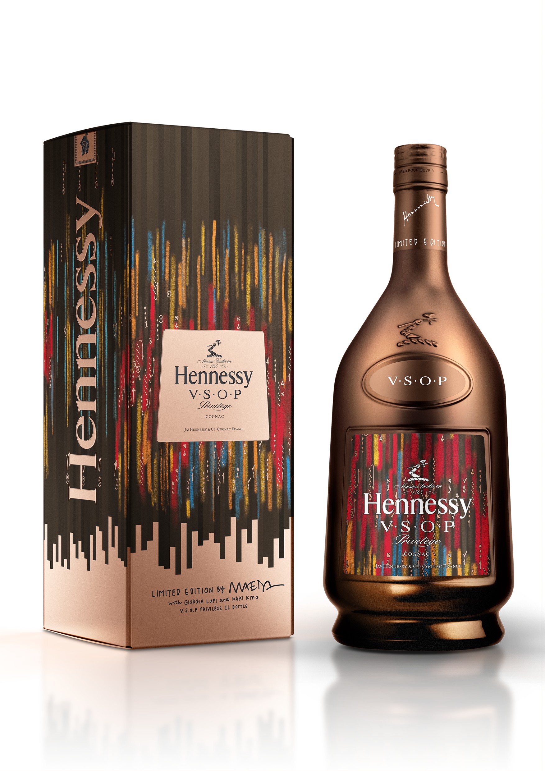
I was thrilled to have the opportunity to be part of an incredible journey: creating and developing the brand identity for Hennessy V.S.O.P. Privilège 2017 Limited Edition.
Hennessy - the world-famous Cognac producer - has a history dating back to 1765, when Irishman Richard Hennessy founded the company. Initially an eaux-de-vie trading business, Hennessy is today the most successful Cognac exporter in the world, and is part of the Louis Vuitton Moët Hennessy Group.
For the two-hundered year anniversary of their V.S.O.P. limited edition, Hennessy contacted design and technology legend John Maeda with a challenging brief: how to translate the harmony of the blend of over 60 eaux-de-vie and the story of its making into a unique brand identity?
As testament to the enduring expertise of the Hennessy master blenders, V.S.O.P. boasts a natural balance of strength and smoothness, and a complex texture that is hard to describe through words.
This is why John decided to create a radical experience: he enlisted a data visualization designer (myself) and an experimental musician (the guitar hero Kaki King) to create an even bolder blend.
During a visit to Cognac, he began to grasp the alchemy of making the famous brandy. “Suddenly, it all made sense to me, as if by magic. I needed to make my own blend, but out of unique people. It was a high-risk project, and I’m grateful that Hennessy trusted my instinct.” He here took on the role of symphony conductor, with a nod to the role of the Hennessy Master Blender, whose job is to maximize the potential of hundreds of eaux-de-vie by blending them to their fullest expression. .

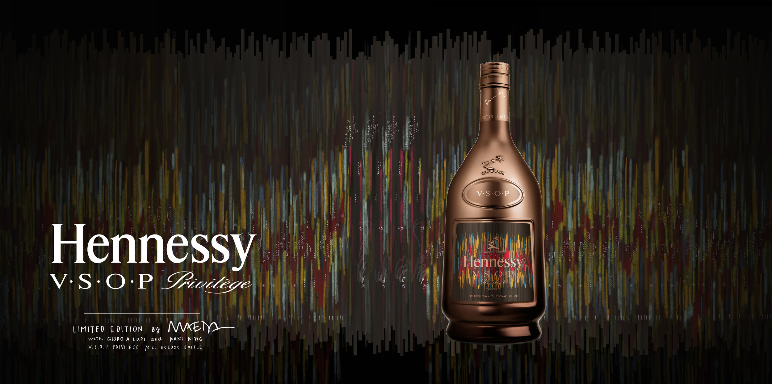
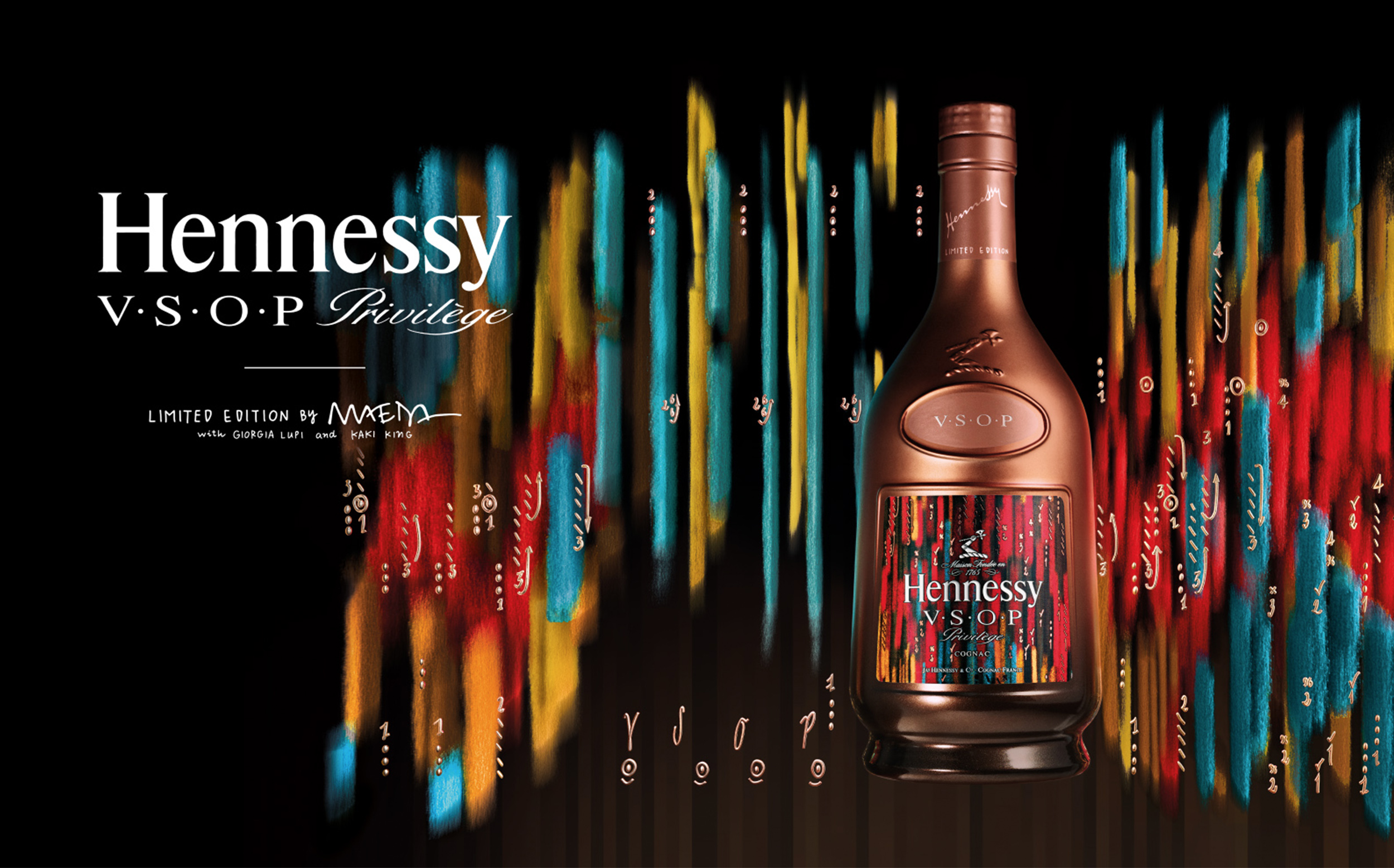
2017 Hennessy V.S.O.P Privilège marks the first time that a prestige Cognac has ventured into the dimensions of music and data graphics
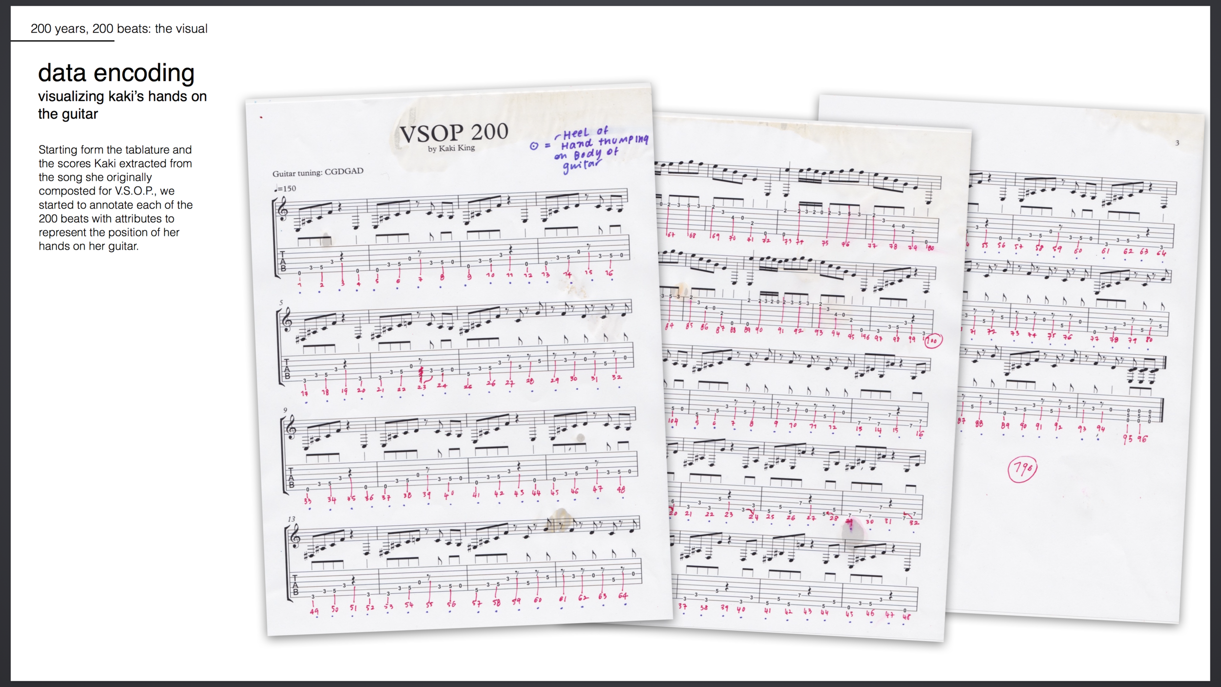
As described in the video above, John envisioned a visual dialogue between Kaki’s hands and mine to create the base artwork for the identity, a symbol of the craftsmanship and the manual labor that goes into creating V.S.O.P.
Inspired by the atmosphere she absorbed on an immersive three-day trip to Cognac, Kaki started to compose and record musical phrases that embody the spirit of what she saw, learned, and felt.
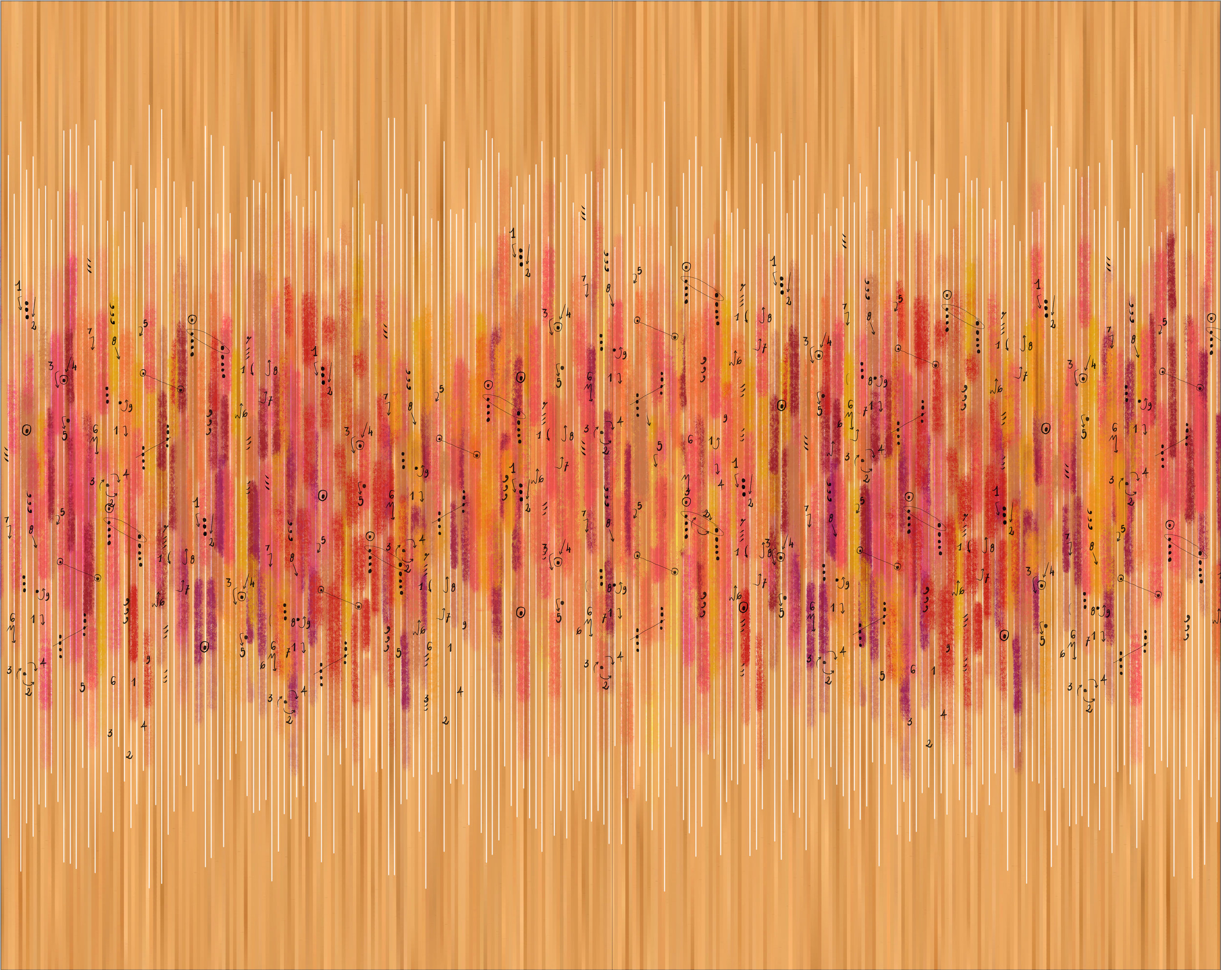
Once she returned from her trip, Kaki and I analyzed and “measured” her spontaneous creation and turned it into data by observing both the music itself and how Kaki’s hands moved on the strings and across the fretboard.

Initial sketch representing the possible dimensions to encode in a data visualization

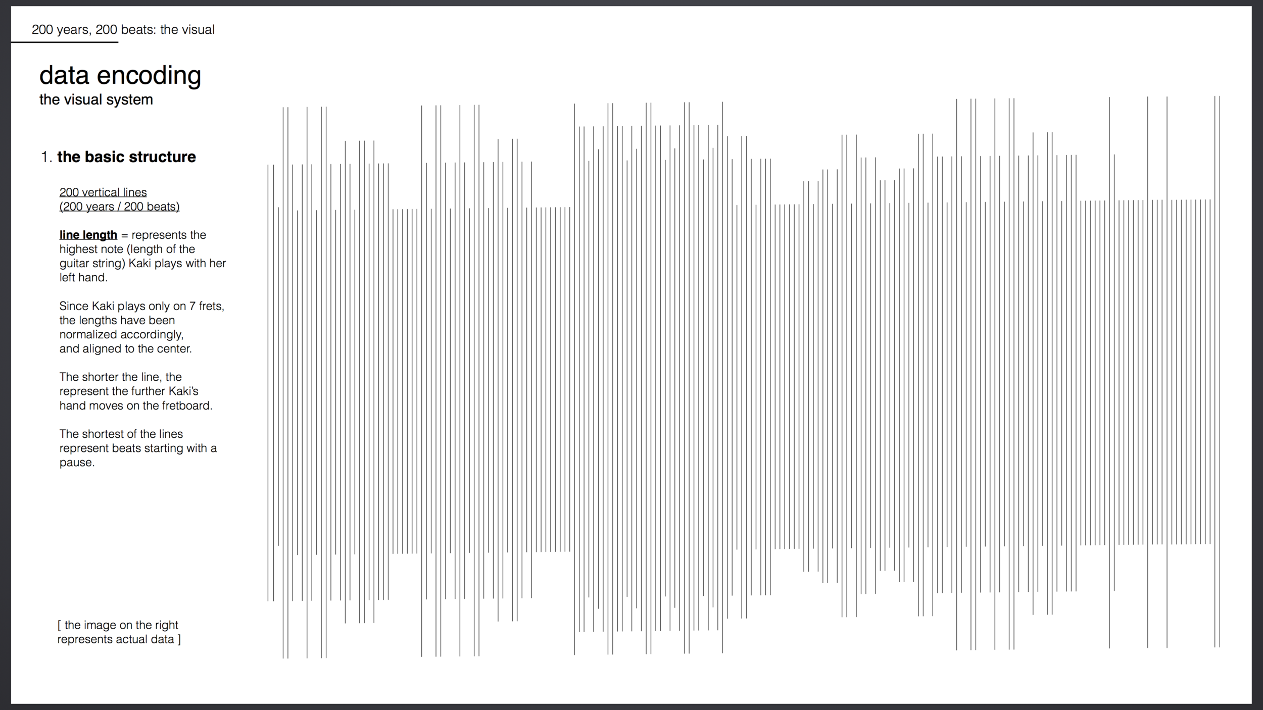
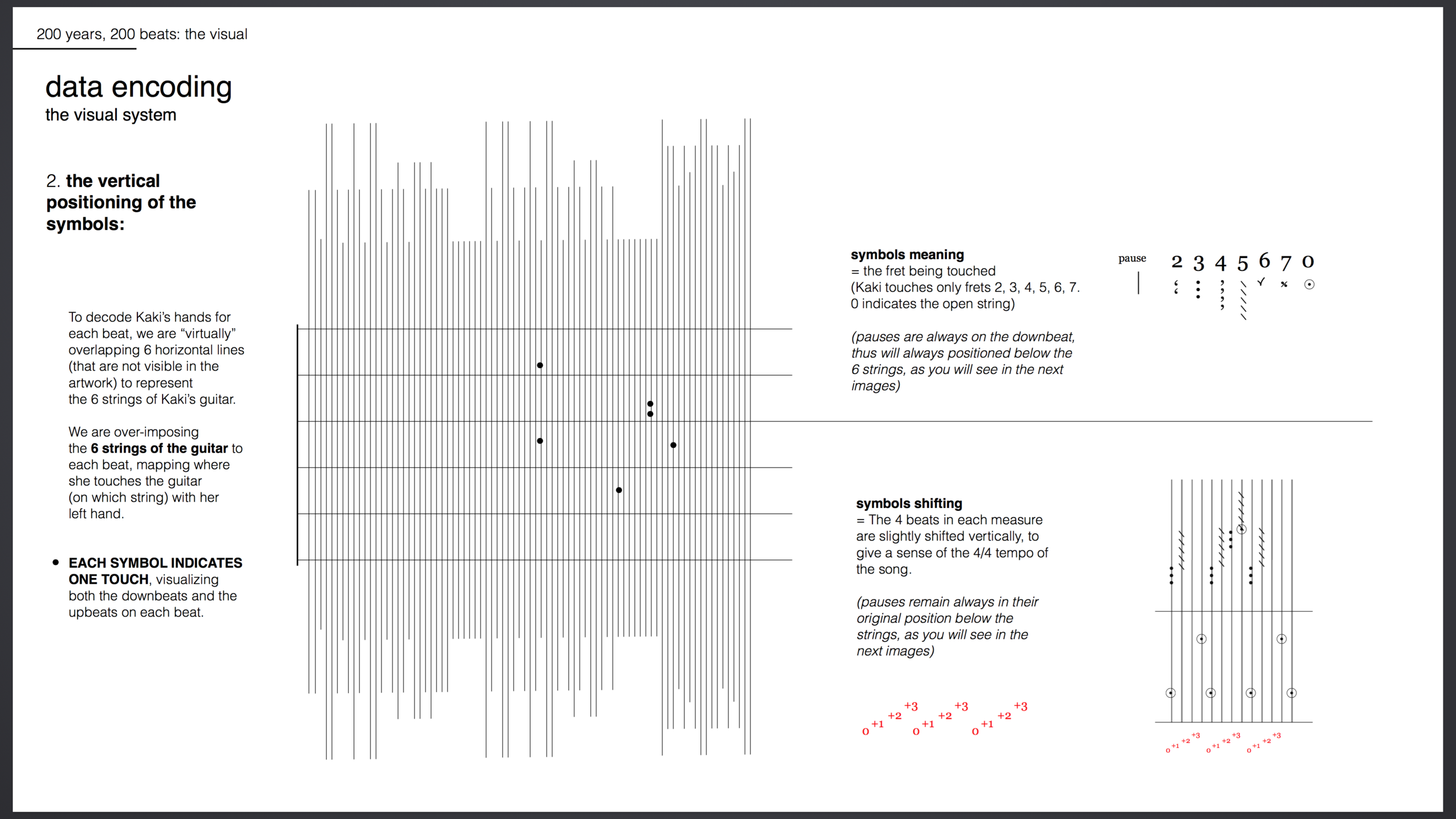
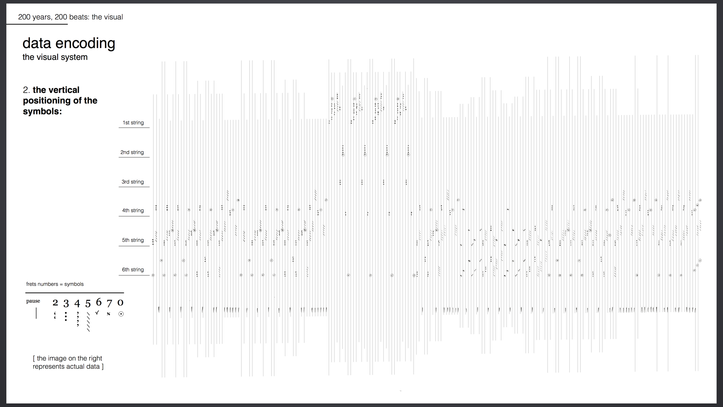
I was interested in creating a visual system to translate this very human set of data into a visual code that retained the “flavor” of the musical composition and of the places that inspired it. I also hoped to integrate this set of rules I was creating, with important bits of Hennessy’s history, to provide a more layered and complex rendition of the history and texture of V.S.O.P.

The visual system's design

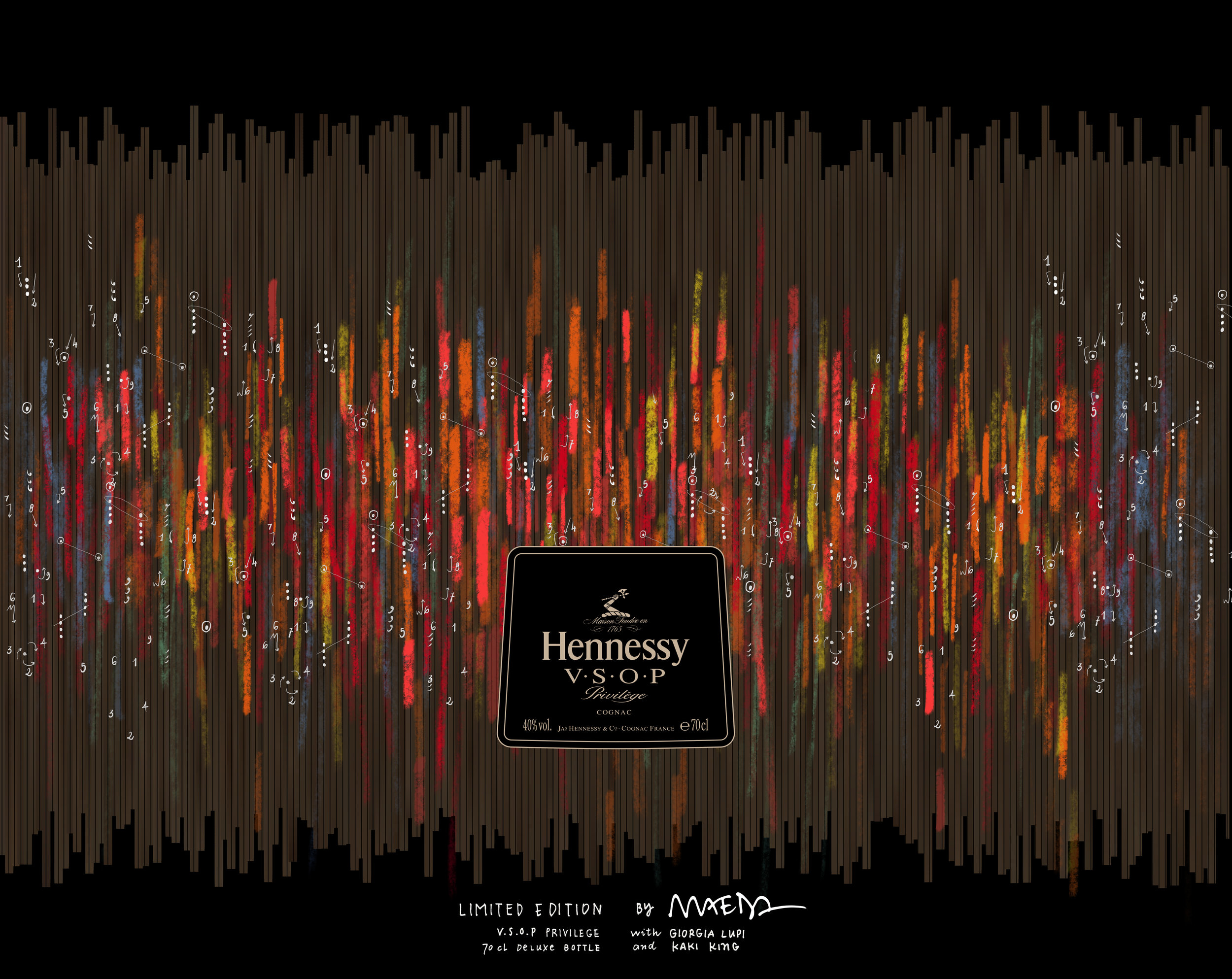
Data visualization of the song, and brand identity
An important visual reference that characterizes Hennessy and V.S.O.P. is the chalk calligraphy that is always present on the barrels as they age.
In the brand identity, this bit of history was used as inspiration to create visual elements that represent the way Kaki plays guitar

Original calligraphy from Hennessy

Extrapolation of visual symbols
In particular, the instructions that show how to draw each letter of the alphabet were abstracted and used to illustrate Kaki’s hand gestures — frets, hammer-ons and pull-offs, slides, taps...

Original calligraphy instructions from Hennessy

Extrapolation of visual symbols
Single strokes from the cursive alphabet were isolated to create abstract elements, and utilized to connect multiple beats, becoming sinuous arcs that are a commonly used trait in V.S.O.P.’s branding

Original calligraphy from Hennessy

Extrapolation of visual symbols
My work is translating numbers into images, but it is also understanding the context for these numbers, and sometimes even finding out where I can see and find data, the material that I use to tell stories in every different contexts.
In this collaboration we explored a visual representation of numbers’ most human and intimate aspects, reconnecting them to their context and to what they stand for: people, stories, art.
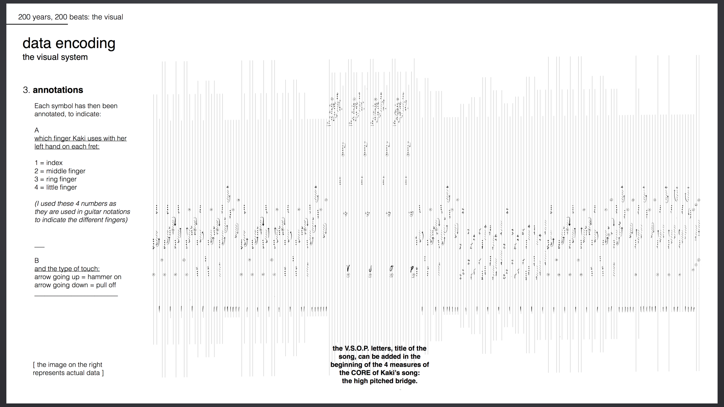
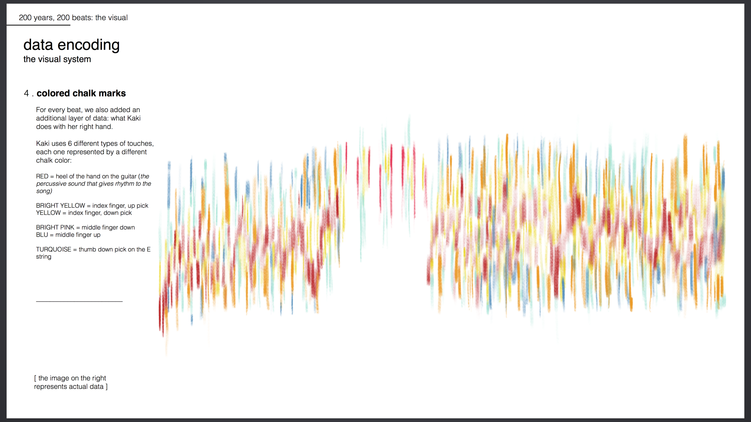
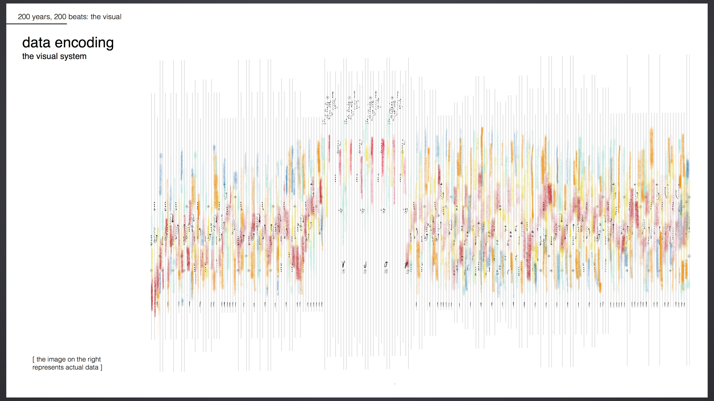
The next images present and explain the passages and structures used to create the data visualization of Kaki's song , constituting the new brand identity for Hennessy V.S.O.P.'s two-hundred year anniversary.