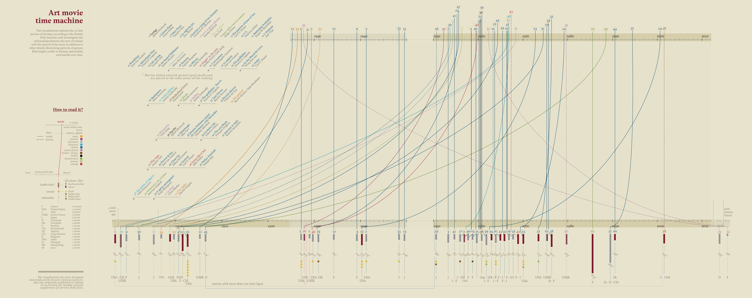
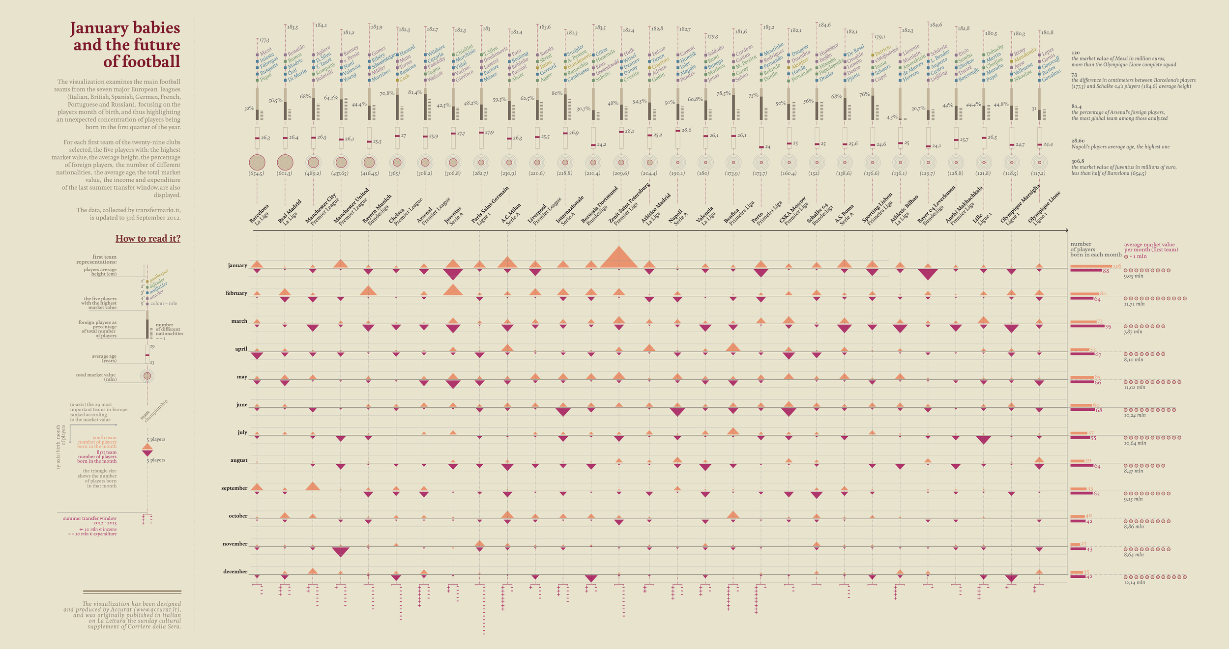
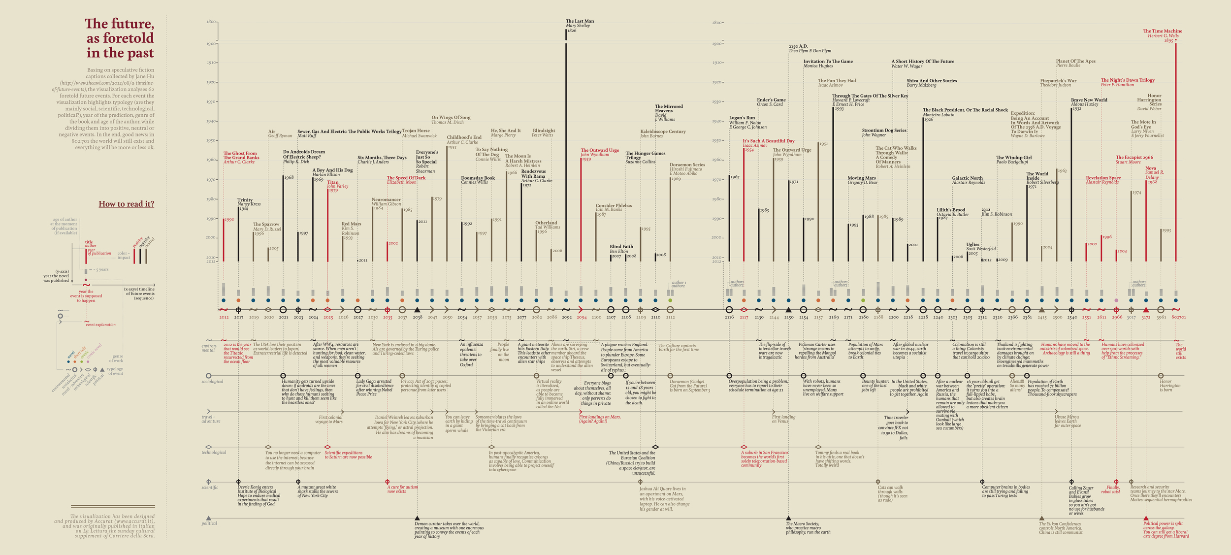
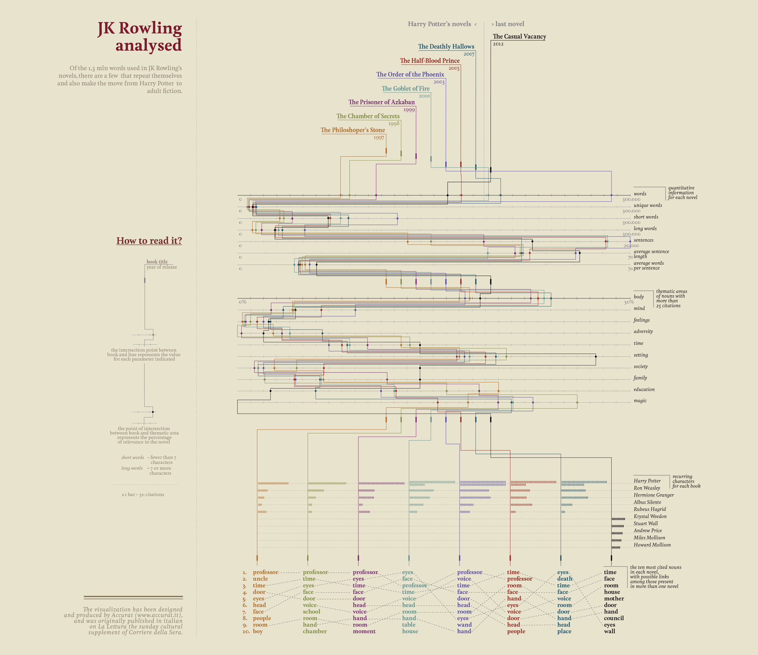


Visual Data - La Lettura
At Accurat we’ve been working side-by-side with the newsroom of Corriere della Sera for over two years, designing a series of of exploratory data-visualizations originally published for La Lettura, their Sunday cultural supplement.
We aim to deliver rich visual narratives able to maintain the complexity of the data while making this complexity more accessible and understandable. Simply put, we publish =complex stories told through data visualizations.
For each story we consider and pursue a topic we believe worthy of exploration, ranging from current affairs to historical or cultural issues. Sometimes choices are driven by a fascination we have, sometimes by a compelling dataset we find and start from, and other times we choose to present events and topics that are hot at the moment. We then analyze and compare different kinds of datasets identifying and revealing a central story - hopefully an unexpected one.
We start from a question or an intuition we have and work from there, then try to put the information in context and find additional facts and materials to potentially correlate. We always aim to move away from mere quantity in order to pursue a qualitative transformation of raw statistical material into something that will provide new knowledge: unexpected parallels, uncommon correlations or secondary tales to enrich the main story with.
In this respect our work here cannot be considered data-visualization in the pure sense: we are not just providing insight into numbers but into social issues or other qualitative aspects as well.
Because we publish on a full-spread format within the Sunday cultural supplement of the largest-circulation Italian newspaper, the leading narrative and the visual ways through which we display information have to be both compelling and attractive: once the first attention of the audience is “caught” by the aesthetic features of the image, the presentation of the information must be clear.
Discover more:
Full gallery on Flickr,
Get prints on Society 6
Read my article on Medium on how we build our visualizations.
Our visualizations for La Lettura have won major awards and have been featured in many books, magazines and interviews.
See "awards and press" page for more information.
Nobel prizes and Laureate on:
Brainpickings, Fast Company, the 25 most beautiful data visualizations of 2013, Popular Science, Cool Infographics, Courier International, Forbes, Arcade magazine, Explore, United Academics, Infographics mania, among others.
Visual Timeline of the Future on:
Brainpickings, The Atlantic, Slate, Popular Science, Flowingdata, Visualoop, Toptrends, The Data Art Review, Torbooks, Disnovation festival, among others.
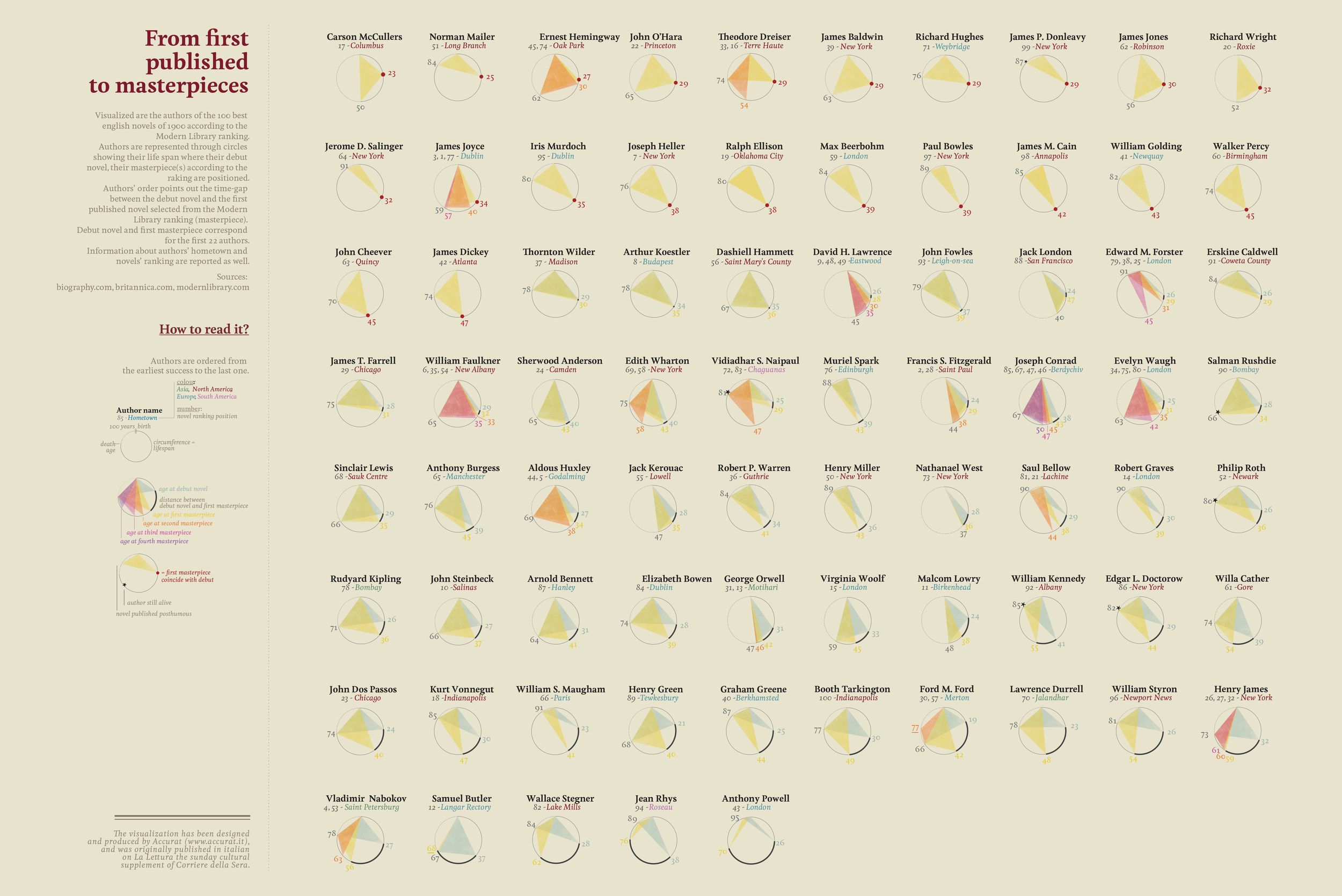
The Creative Pace of the 20th Century’s Greatest Writers on:
Brainpickings, Gizmodo, Visualoop.
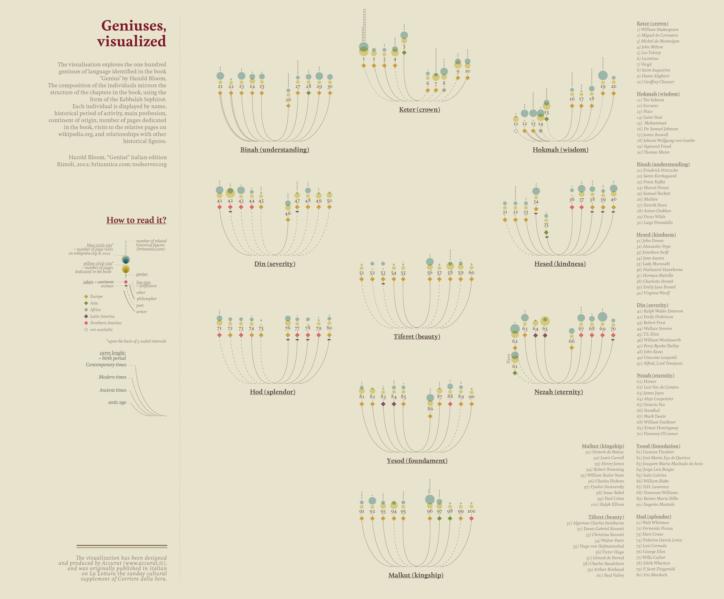
Geniuses, Visualized on:
Brainpickings, Artipickings.
The Brain Drain, on:
Brainpickings, Landmark Project.
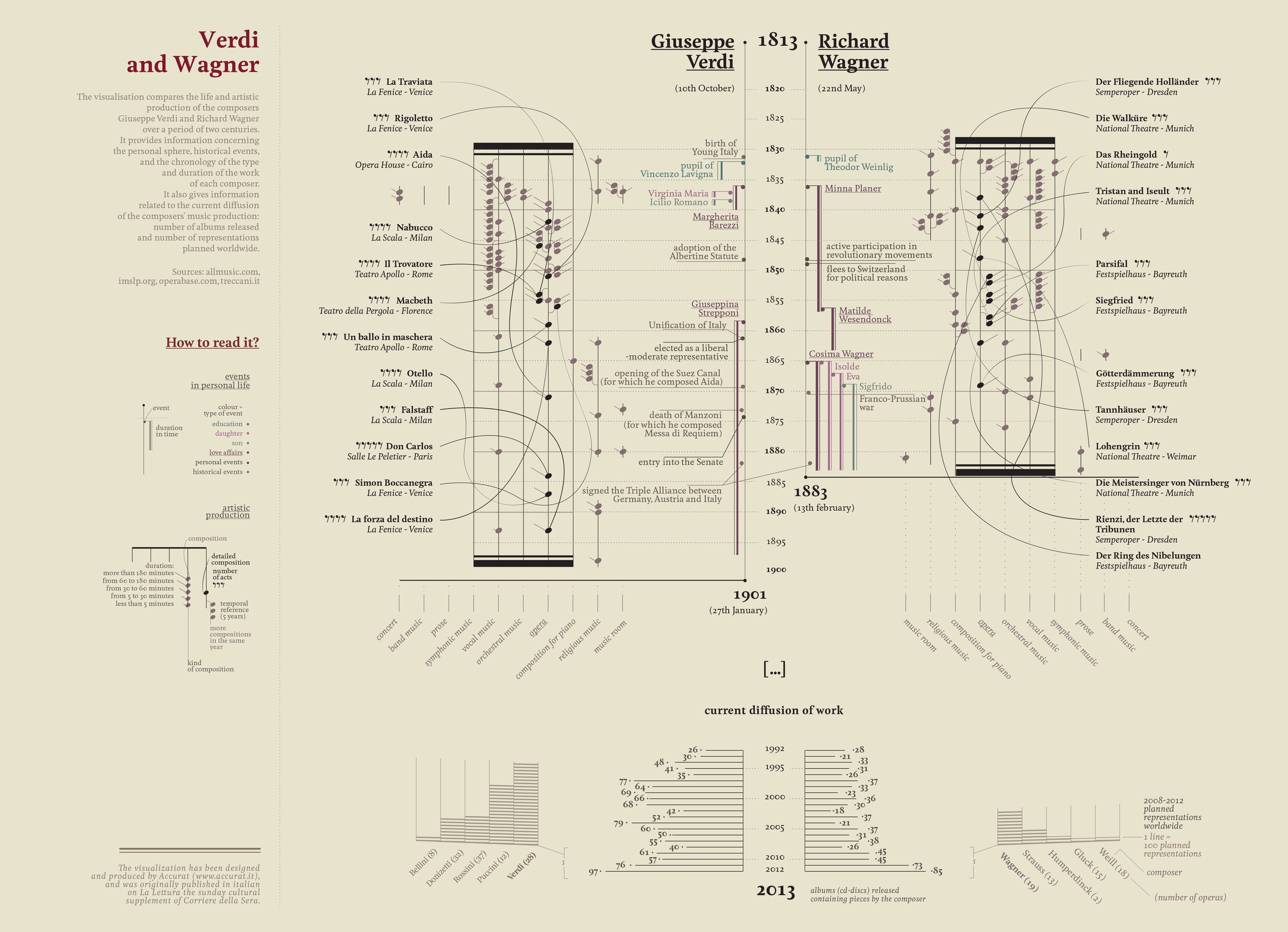
Verdi and Wagner on:
CNN Money.
A History of Times The World Didn’t End on:
Popular Science, Gizmodo, Slate.fr, Business Insider.